Initially, Betfair graphs can appear confusing, but they don’t need to.
This revised and updated post covers:
- How Betfair graphs and charts work. Step by step.
- Why they’re important (and how to read them).
- My own early experiences using them in that original post
Here we go…
Understanding How Betfair Graphs Work
It’s a common misconception that Betfair graphs are of little or use. There are occasions where they don’t provide much assistance, although more often than not they are great. But only if used correctly.
The reason most people disregard them is that there’s no time stamp. I’ll admit that can be frustrating, especially when you’re starting out. Understanding everything else is hard enough!
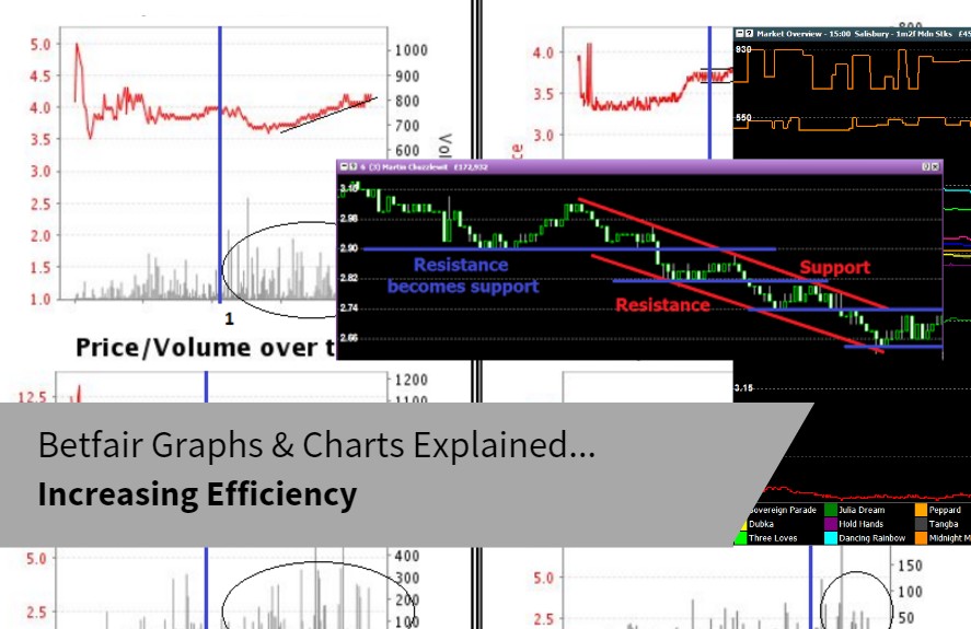
So, how exactly do Betfair graphs work? Check out the image below.
First of all, you have price listed on the vertical axis, and time on the bottom. The confusing bit being; there are no time increments added to the graph. It’ll become apparent why new traders are easily confused because of this. As usual, being informed can save you a whole lot of hassle (and financial loss).
Pricing is simple to understand, with the increments in price being up the side. In our example, you can see the price has followed the trend quite smoothly, from 4.5 into 2.5.
So what are all the little grey bars about?
Traded volume is expressed by the grey spikes from the bottom up. So you can see, there was a whole load of money matched shortly below 3.5 (what time that was, we don’t know). That’s pretty simple, now we can look at actually understanding what this information means.
How to Read a Betfair Graph
First, it’s important to point out; information shown on any of the Betfair graphs is purely historical data. Just because something happened doesn’t mean it has to carry on. Fortunately, patterns do tend to repeat themselves, though as I’ve learnt over time.
The hardest part of reading a Betfair chart or graph is comparing it to the other outcomes within the event. Particularly in horse racing markets, where the markets are more sentiment-based. If you’re focused on Betfair charts for horse racing, look for sudden price drops with a spike in traded volume. These often signal a gamble or a shift in market sentiment.
Traded volume is often linked to the price movement as you would expect. When that was isn’t always clear. However, in some instances, it can be that little bit of missing insight you needed to finalise a decision. In theory, traded volume should pick up considerably within the live show (final betting show before the race). Large amounts of money matched beforehand can sometimes be a pointer. Especially if it’s completely disproportionate to the rest of the market’s activity.
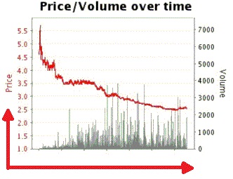
Going back to our Betfair graph above, it’s likely the live show started around about halfway on the chart.
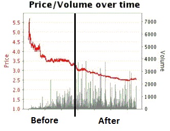
See how that’s confusing? The first half could have been 5 hours leading up to the race, whereas the final 10 minutes are the other half. Not ideal if you’ve turned up with a few minutes to spare, but over time it becomes easier though. Particularly when you’re aware.
Why Graphs and Charts Are Important
So you understand what they are, how to briefly read what’s happened before you turned up. But why’s it important?
Like I said previously, it’s just an indication of what’s already happened. But when used in conjunction with other indicators, it can be the confirming or denying signal to pulling the trigger on that winning trade. Information is key, there’s nothing worse than missing out when the evidence was right there under your nose all along!
In markets where there is lower liquidity, the Betfair graph can be a little trickier to read. However, it’s a double-edged situation as large gambles are likely to stick out like a sore thumb also. When using Betfair exchange graphs, large early bets or mismatched prices can reveal value opportunities before the wider market reacts.
This leads me on to support and resistance quite nicely…
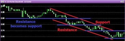
Support and resistance are often a lot clearer when expressed on a chart or graph.
The human mind finds it a little harder to track when watching the ladders alone. Looking at the image above, it’s quite clear how a previous resistance point within a betting market then becomes support, after breaking. Obviously, it’s just a good example; it doesn’t always work out like that. But again, it’s another point checked off to support your trading argument to enter or exit.
Most of the time, standard Betfair graphs aren’t so clear when it comes to this sort of thing. If you skim back to the earlier graph displayed, you’ll see similar patterns (a lot tighter packed).
Either way, the graphs can be of use in most instances. Just another string to your trading bow…
Here’s an original post on how I interpreted things back when I was just finding my trading feed (a newbie trader if you like).
Update: See this YouTube video about Betfair Graphs…
Sunday 30th Jan 2011…
My most favourable approach is to look at the Betfair graphs as an overall indicator of the market.
Not just a short-term one-trick pony! If you base a trade purely on one Betfair graph it doesn’t make too much sense to me. The whole market works together, sometimes resisting each other (prices) and sometimes spurring each other on.
Below is a pic of the top 4 heading the betting in on the race. I did rather well in this race purely because I interpreted the Betfair graphs correctly. An ideal situation!

(Betfair graphs, look how they relate to each other – click to enlarge)
So I took the screenshot of the Betfair graphs 15 seconds before the start for full effect.
The blue lines show where the Betfair graph was when I first opened the market (with about 8 minutes left to go). To the left of the blue line is of little relevance in my opinion (I may be wrong but at this stage but I’m focusing purely on the starting shows).
- Runner 3 caught my eye as it was already gently steaming up until the live show.
- Runner 2 was of a little interest as it already had some volume to it prior (worth keeping an eye on in case that changed though).
After a minute or so of watching it was obvious this was going to be a scalping type of market. Unless anything major cropped up with big orders coming in late on. There wasn’t a clear trend.
It’s likely there was a lot of traders on runner 2, as there was a lot matched on this runner without a great amount of movement… the market was ‘ranging’ so I left that one alone.
Runner 4 was of no interest to me as the fill rate was going to be poor at that price. This left me in a bit of a predicament if I was to get caught on the wrong side of things (turnover is safety in my eyes). So that left runners 1 and 3, the slightly more interesting Betfair graphs if you will.
Using Betfair Graphs…
Runner 1 was the Fav according to all the bookies, it had shortened slightly. It couldn’t have been too popular, though, as support never came, and it drifted shortly before the off. When volume increased, it started to drift at a reasonable rate. So as soon as that happened I was sat there waiting with only one thing to do really…. back runner 3, playing it defensively.
Sounds all very eas,y doesn’t it? not always a case of seeing what is going to happen but more of seeing what ‘can happen’ and if it doesn’t? scratch at the entry!
In all honesty, it was an educated guess into the markets. Looking at the current activity the whole time. I wasn’t ‘certain’ like people seem to think traders are most of the time.
I rode it from 7.8 to 7.2, taking a scalp or two on the way. Only a few ticks but at 0.2 a tick it doesn’t take a lot to make money. Reading the graphs seems to work a lot better for swing markets rather than the scalpers I find. But the main point I want to make is; a lot of this conclusion come from looking at the bigger picture. How everything was fitting together, or not in some cases. If I’d just looked at one graph I’d have been quite lost… even more so if I wasn’t even aware!
Results
On Sunday, I was fortunate to have some spare time. It was a slightly better Sunday than usual, with more betting activity in general.
Sometimes Sundays can be quite dull. However, it’s the only time I have to trade currently. Adopting the slow and steady attitude rather than the ‘bigshot’ attitude produces far better results for me. I think it’s purely down to confidence, but over time I guess I’ll understand more.

On a day where I have the ‘bigshot’ attitude, typically P/L will be +/- £5 to £30 in a race, and less consistent. Less consistency catches me out every time!
The ‘slow and steady wins the race’ attitude I took yesterday is far better for me on a mental level. My maximum stake was £60, so I was never out of my comfort zone at any point.
Profit and loss show what I mean by slow and steady. Only losing in 5 of 20 markets is a real confidence boost too…
Article: Horse Racing Trading on Betfair
9 thoughts on “Betfair Graphs Explained: How to Read Charts & Market Trends”
Great post about the graphs and your interpretation, logical and concise. Thanks, I’m a learner and this is really helpful.
Nice consistent profits and losses kept to a minimum, just as it should be. Good luck.
Its common sense really AG, just gotta get used to doing it. Thanks anon.. i think its the way forward just gonna keep chugging along like this for a bit before i up the game again.
Hi Caan
Nice work on the graphs
Ive added your blog to my adapt&surive page 😉
Hey!
What do you do wrong when you only lose the horse races?
Can you explain a little more Roger?
HI Caan ,
Can you please tell me the settings you used to get the candlestick chart above the youtube video looking the way it does? essentially I’m interested in the candles being small in proportion to the grid, like you have displayed on yours. Thanks in advance.
Jason
Hi Jason, check out the user manual 🙂 most of the settings are changed via right click on the actual chart.
Hi Caan
Just ordered your book on Amazon, so looking forward to reading that this week. Thanks for the great YouTube videos, they are really useful to a newbie. Have been dabbling with the Exchanges over the last three weeks and bar a daft mistake laying a favourite and losing £44 have used your helpful videos, to sit back and watch many races with all green showing! Best one so far for a small stake was £8.00 on any horse and £15 if I got the win, regardless of the result I was on a winner and hooked until the next time when I had to get out quick! So to anyone thinking of having a go, with the right help and patience it can pay. I’m certainly losing far less than when I backed traditionally with Lucky 15’s and combination forecasts.
Just one question for you, on Betfair it has 6 columns, the two in the middle for the back and lay and then the two either side, is the only purpose of those to show you the most recent trades?